


Modern SharePoint Web Parts Updates — Spacer and Divider
- Blog
- SharePoint
- Post

I am a huge fan of the Modern SharePoint experience. Is it perfect? Definitely not. However, the modern experience offers a responsive design, easy-to-use web parts, and is user-friendly. I have seen customers adapting to Modern SharePoint faster than they did to Classic SharePoint.
The changes are following each other rapidly. The web parts delivered with the initial release of the Modern SharePoint Team Site are also evolving and regularly receiving updates. I want to keep you all up-to-date, so I decided to start a new series called Modern SharePoint Web Part Updates! Let’s continue with the spacer and divider.
The formatting of Modern SharePoint Pages had room for improvement from the start. We were able to add a text web part but that’s basically it. We are now receiving additional web parts to create diverse and creative pages. The new web parts are the spacer and divider. Let’s take a look at the divider first:
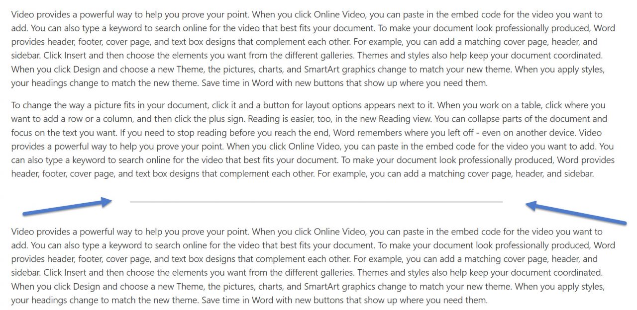
No rocket science here, you add a grey line between web parts, which will separate content blocks from each other. That’s a great web part for all you content editors out there. Unfortunately, there are no additional settings to change the look and feel of the divider. I am hoping for changes to the color or thickness of the divider. Next up: Spacer!
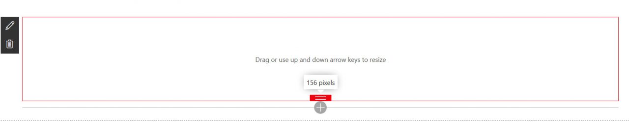
You add space between web parts based on pixels. You can hide the web part for mobile devices. That’s probably a good idea because of the smaller screen sizes.
These are great new web parts for content editors! I am still waiting for an update to the text editor web part because that’s really too basic. An update was announced at Ignite, so fingers crossed!