


Modern SharePoint Web Parts — Quick Links Web Part

I am a huge fan of the Modern SharePoint experience. Is it perfect? Definitely not. However, the modern experience offers a responsive design, easy-to-use web parts, and is user-friendly. I have seen customers adapting to Modern SharePoint faster than they did to Classic SharePoint. The changes are following each other rapidly. The web parts delivered with the initial release of the Modern SharePoint Team Site are also evolving and regularly receiving updates. I want to keep you all up-to-date, so I decided to start a new series called Modern SharePoint Web Part Updates!
Let’s continue with the Quick Links Web Part. This Web Part has been around for a very long time. I am not sure if it was here from the start of the Modern Experiences, but definitely a long time! Today, I witnessed first hand the power of the Microsoft release cycle. I configured a SharePoint Team Site for one our customers. They want to collaborate, in a closed space, with colleagues and external users. I showed them the Quick Links Web Part and noticed a lot more lay-out options:
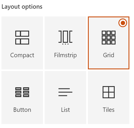
We had the compact and grid (that was named differently, wasn’t it?) but have four additional views! Let’s take a quick look. Follow me!
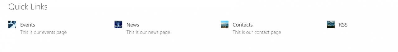
Compact
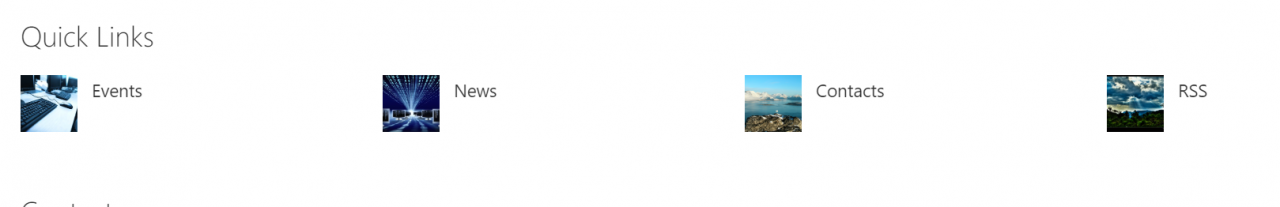
The Compact view is perfect for displaying a lot of links because of the smaller icons. This will take up less space in comparison with larger icons and a lot of links.
Filmstrip
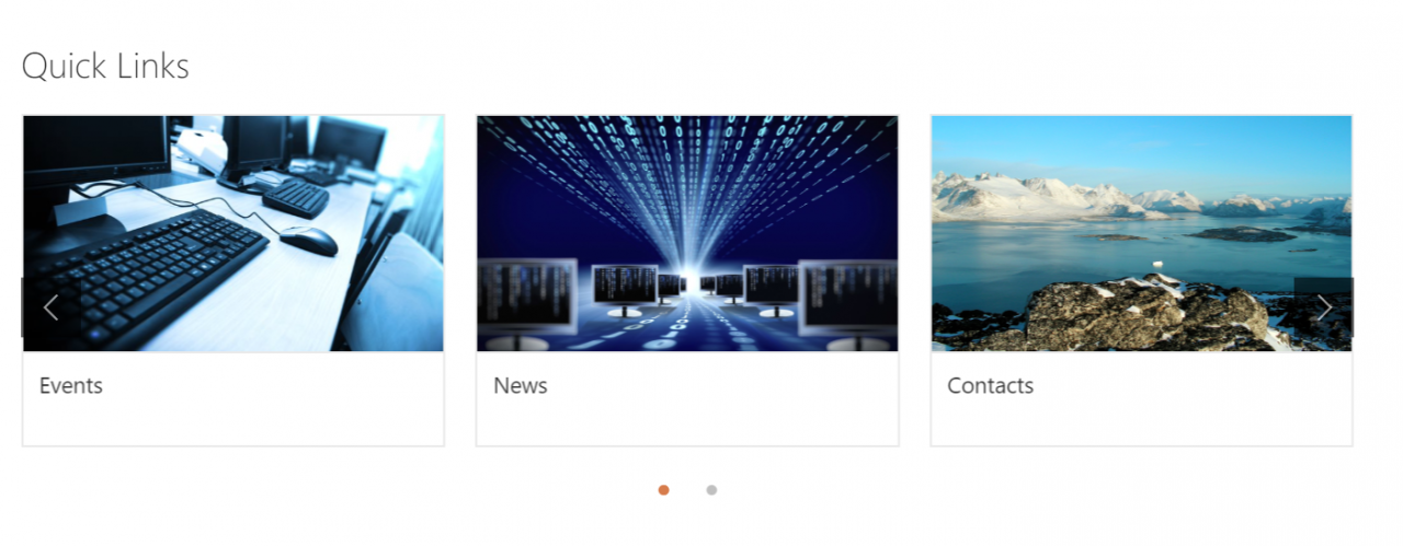
The Filmstrip view displays links with a slider. You can see the dots at the bottom and the arrow at the right side of the last image. The downside of this view is the scrolling because this is, you will be surprised, not always very clear for end users.
Grid
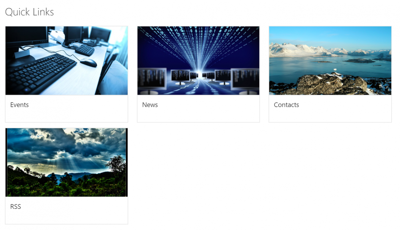
The Grid view is very similar to the Filmstrip view apart from the slider. The links are all, no way, displayed in a grid. Definitely takes up more space on the page but a good alternative for end users struggling with the Filmstrip view.
Button
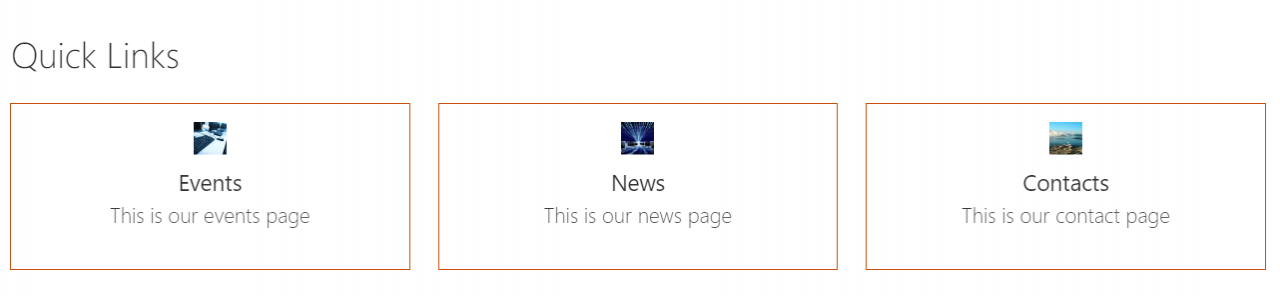
The Button view has multiple options:
- Show descriptions (eg: this is our events page)
- Icons:
- Icon on top
- Icon on left
- No icon
- Button appearance:
- Outline
- Fill color (the color is connected to your SharePoint Theme)
- No outline
- Alignment
- Left
- Center
- Title text
- One line
- Two lines
I definitely like this new view! Gives content owners a new
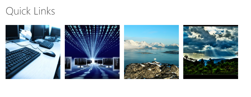
List
The List view is basically the same as the Grid view apart from the description and the ability to remove the images. The last option isn’t actually that bad:
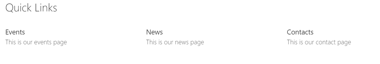
A bit boring but what the heck. There is something for everyone.
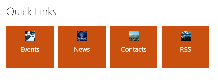
Tiles
Last but not least, the Tiles view. This view varies from ugly, to really ugly to not bad at all! Let’s start with really ugly:
You must really hate your members when you select this view. Oh my. Moving on to ugly:
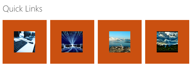
Still pretty bad. Pretty, pretty, pretty bad. Is there hope for the Tiles view?
This view is acceptable and not that bad. There is no text but just the images with a connected link.
I am joking here and there but I am happy to see all these new options. The Quick Links Web Part is used a lot in the real world. This gives all you content editors out there so more flexibility. Happy quick linking!